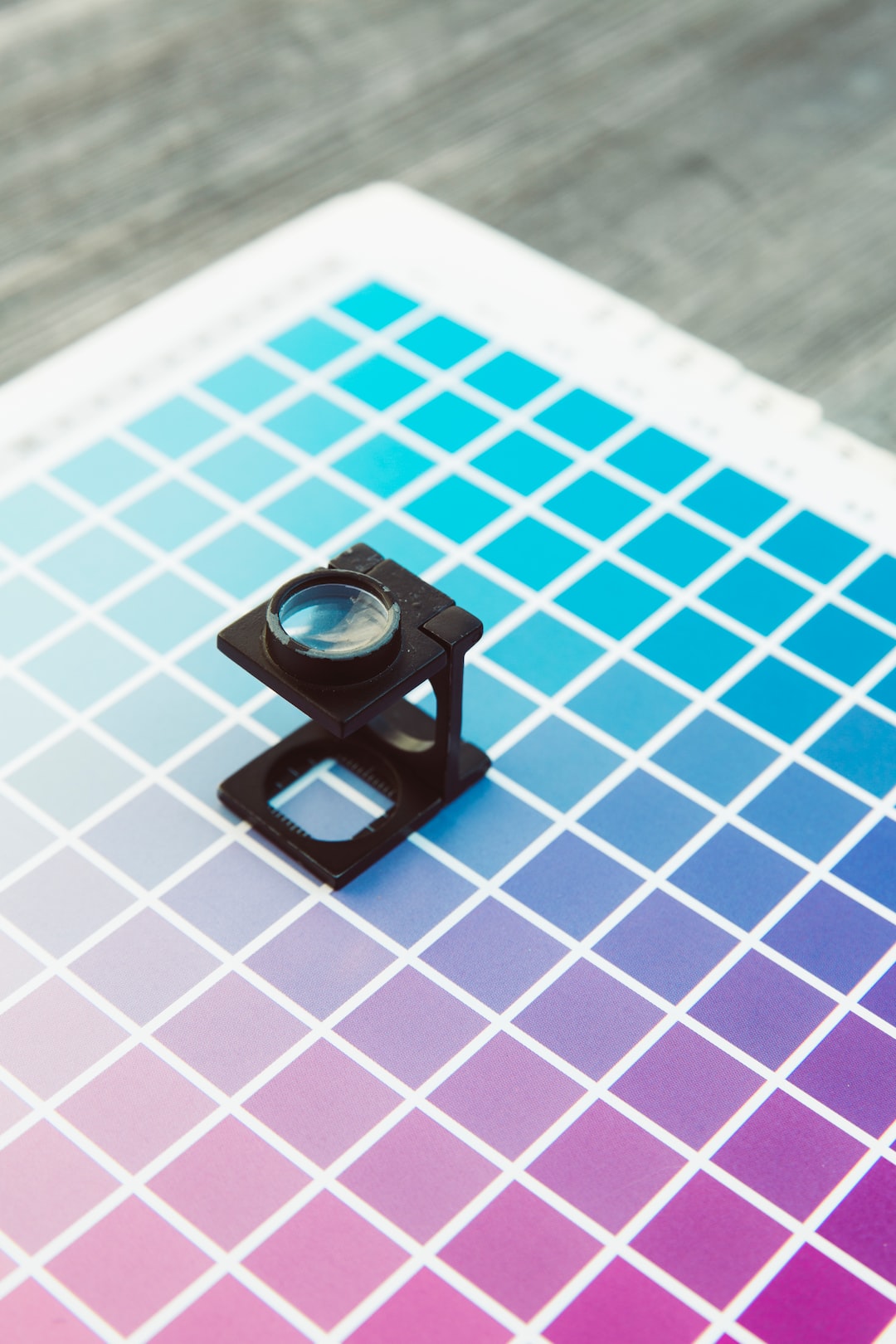
The Psychology of Colors in Print Advertising and Branding: A Deep Dive into KII Print
Understanding Color Psychology:
Colour psychology explores how different hues can trigger specific emotional and psychological responses. It is essential to recognize that these responses are not universal; cultural, personal, and contextual factors can influence them. However, there are several broad associations that certain colours tend to evoke:
1. Red: Often associated with energy, passion, and excitement, red can grab attention and stimulate urgency. It’s commonly used to convey a sense of action and intensity.
2. Blue: Blue is known for its calming and trustworthy qualities. It’s often employed by brands seeking to establish reliability and professionalism.
3. Yellow: Representing positivity and optimism, yellow can be attention-grabbing and create a sense of warmth and cheerfulness.
4. Green: As a symbol of nature and growth, green is often used to convey freshness, eco-friendliness, and health.
5. Purple: Associated with luxury, creativity, and imagination, purple can evoke a sense of elegance and uniqueness.
6. Orange: Combining the energy of red and the cheerfulness of yellow, orange is often used to create a playful and enthusiastic brand image.
7. Black: A colour of sophistication and power, black is commonly utilized by brands aiming to project authority and exclusivity.
8. White: Representing purity and simplicity, white can create a sense of cleanliness and minimalism.
Harnessing Color Psychology for KII Print
KII Print, as a brand, can strategically employ the psychology of colours in its print advertising and branding efforts to effectively communicate its identity, values, and offerings:
1. Color Consistency: Consistency in colour usage across various print materials and branding elements helps establish a cohesive and memorable brand identity. KII Print can select a primary colour that aligns with its values and message and then use complementary colours to enhance its visual appeal.
2. Target Audience: Understanding the preferences and expectations of the target audience is crucial. Different demographics respond differently to colours, so KII Print should choose colours that resonate with its specific customer base.
3. Emotional Resonance: KII Print can leverage colours to evoke desired emotional responses. For instance, if the brand aims to convey trustworthiness, a dominant blue hue can be utilized.
4. Differentiation: Using a unique palette can help KII Print stand out in a competitive market. Selecting an unexpected or less common colour for its industry can make the brand more memorable.
5. Contextual Application: The context in which colours are used matters. A bright and attention-grabbing colour might be suitable for sale promotion, while a subdued colour might be better for conveying professionalism in business correspondence.
In conclusion, the psychology of colours unveils the remarkable influence that different hues can exert on human emotions, behaviours, and perceptions. From soothing blues to energizing reds, each colour triggers a unique response, making it an invaluable tool in communication, design, and branding. As brands strive to connect with their audiences on a deeper level, understanding the psychological impact of colours becomes imperative. This principle holds true for KII Print as well, as they harness the power of colours to not only captivate attention but also to evoke the desired sentiments, creating a lasting impression in the minds of their customers.
Building 74, Ground Floor, 2nd Cabin, Suryavanshi Layout,
Doddaballapur Main Rd, opposite SHRIRAM SUHAANA APARTMENT,
Yelahanka, Bengaluru, Karnataka 560064
Email: support@kiiprint.com
Mobile: +91 9875900467


